
Double U vs Drum and Feathers
Welcome to Ute Hub › Forums › Utah Utes Sports › Football › Double U vs Drum and Feathers
- This topic has 13 replies, 11 voices, and was last updated 6 years, 2 months ago by
PhiladelphiaUte.
-
AuthorPosts
-
-
 McBride of FrankensteinParticipant
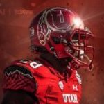
So are you all seeing this? There is a slow burn move from the Drum and feathers logo to the double U logo. Me personally I like it. Two questions 1) are you seeing this like I am that it is a concerted movement?, 2) what do you think?
-
 Larry BParticipant
I don’t know if it’s a concerted movement but I do love it. My favorite uniform is the “throwback” that they introduced some years ago. I wish it was our normal uni.
-
FtheY
Participant^^^this
-
-
Participant
I also like it, but wouldn’t want to lose the drum and feather either.
Yes to #1. Most thumbnail logos are the interlocking U…maybe it just displays better as a small image? Could be intentional, who knows?
Yes to #2, and hope we see a super cool helmet design this year that’s better than the field goal hands or swoop wings. Didn’t care for either of those, although I could see why folks liked them.
-
 UteThunderParticipant
There’s definitely an intentional effort to move away from the Drum and Feathers. I don’t like the move. The interlocking U’s reminds me too much of Oklahoma and Houston.
I do like the throwback uniform, but it would be so much better if they did the same uniform with the Drum and Feather.
-
PhiladelphiaUte
ParticipantAgreed. I much prefer the “Drum & Feather” logo over the “interlocking U” one, but wouldn’t be averse to seeing one or two games a year with that 2nd style. That said, I think it our field would like way cooler if we’d replace that “Block U” at the 50-yd line with the “interlocking U” logo instead.
Most importantly, I hope we never again see the “Rice University wings” or the “field goal hands” helmets ever again. Those totally SUCKED!
GO UTES!!!
-
 StaplesParticipant
Interesting that you mention that because I was discussing the midfield logo with my Dad at the Spring game. Personally I’d go with the drum and feather, but I wouldn’t have any problem if they went with the interlocking U’s.
-
Participant
I believe the “Drum & Feather” would look better than that bland “Block U” we’ve been using, but it might look a bit “too busy” for a midfield design. The “Interlocking U” in my opinion would be just right.
-
-
-
-
 EagleMountainUteParticipant
I like the interlocking U. DnF is a clean unique look that I don’t think is going away. Marketing the way it is you have to be flashy. Look at the amount of professional team logos.
-
 noneyadbParticipant
I really liked the spring game helmets. The number on one side and interlocking U on the other looked sharp. Maybe use feather stickers hanging from the U for certain accomplishments. Captain, Dean’s list, degree, etc..
-
 DanielLaRussoUteParticipant
I like the DnF in concept, but it is in dire need of an update.
It is seriously one of the most poorly rendered logos still in wide use.
I think that relates to some of the appeal of the clean and orderly interlocking U’s.
-
 Ute BcParticipant
Correct me if I am wrong but if they just remove the drum and keep the feather we have no problem with any Native American backlash.
-
 Tony (admin)Keymaster
Like clockwork this topic pops up every year
-
StaplesParticipant
Some of the transition seems to not necessarily be away from the drum and feather, but also away from the block U (especially TV graphics.) In my opinion the interlocking U’s and the D&F are both preferable to the block U. I’ve held off getting a U of U license plate for years because the only option at the moment is the block U. If they went back to the either of the other logos I’d order one in a heart beat.
-
-
AuthorPosts
- You must be logged in to reply to this topic.