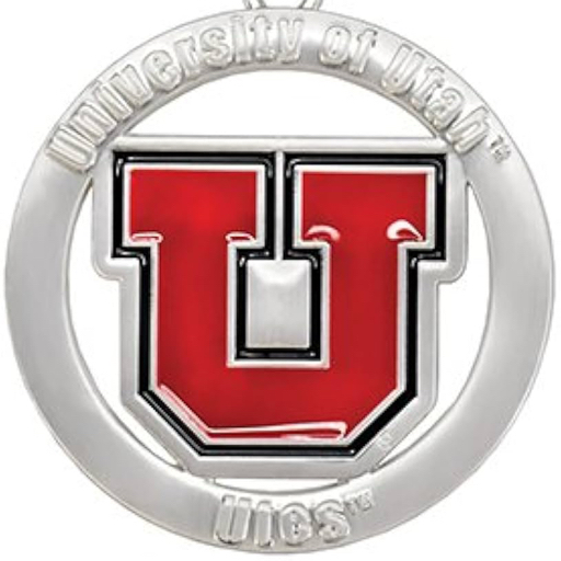
Drum and Feather Logo
Welcome to Ute Hub › Forums › Utah Utes Sports › Football › Drum and Feather Logo
- This topic has 16 replies, 16 voices, and was last updated 2 years, 5 months ago by
 Uteified.
-
AuthorPosts
-
-
 UteifiedParticipant
People comment every so often that they dislike the block U or interlocking U logos. I admit I felt the same way many years ago. But after spending significant time on the east coast, my views shifted.
The drum and feather is cool, but it is ultimately a copy of a NFL team’s former logo (Washington). I found my U gear often getting confused with that team, which annoyed me. I started to gravitate to the interlocking U because it was more distinctive. Anyway, just thought I would throw that out as a counterpoint on the whole logo discussion.
-
 The Miami UteParticipant
Personally, I prefer the “U of U” or “Utah Utes” logos. There’s no reason for it other than they appeal more to me.
-
 UteThunderParticipant
The interlocking U’s look too much like the logos for teams like Houston & Oklahoma.
The Drum and Feather may resemble the Redskins logo, but it is a unique and distinctive look among colleges and the Redskins are no more so that isn’t even a comparison anymore.
-
 Ute DubParticipant
Switching styles back and forth is good for recruiting and player morale. Keep it up!
-
-
 RoboUteParticipant
I have soured on the drum and feather logo for the same reason. It somehow never really occurred to me until recently that it was a copycat logo like Geogia’s
-
 Roy RangumParticipant
While I personally really like the drum and feather, I lived on the east coast for a while and had a colleague there who asked me to get him a shirt with the interlocking U’s because he thought it was so cool. So I think you have something there with it being more distinctive.
That said – I’m good with the fact that we currently have a couple of different logos (interlocking U, block U, drum and feather), as I like the options when it comes to gear.
-
UofU Fanatic
ParticipantI’m definitely more of a drum and feather fan but that’s just a preference. It all looks good
-
 YergensenParticipant
Interlocking U for me. It looks like to me there’s a conscious and gradual shift away from drum and feather. Just my view, I’ve seen nothing reported to this effect, but seems like interlocking U getting more use and exposure as of late.
-
Anonymous
InactiveI agree and prefer the Interlocking U and slightly less the block U
-
 WhittyParticipant
Drum and feather > interlocking Us >>>>>>> block U
-
MacKidsAlumn
ParticipantI just wish the U could get its branding game together. Athletics seems to have adopted the interlocking U, campus uses the block U, the health system uses a version of the block U, and drum and feather is still out there in some of the athletics gear. Pick a logo, stick with it and move on.
-
 NashvilleUteParticipant
I really love the drum and feather logo, but I’m also a realist and know the woke crowd will get us eventually… This clearly isn’t a popular change since I’m sure most of us don’t fall under that heading, but I don’t think we can hide from it forever. I think this is why we’re gradually phasing out the drum and feather and increasing usage of the interlocking U’s. That way when they finally announce the change it won’t feel as drastic maybe?
I’ve also warmed to the interlocking U’s and like it much more than I did in the past. What I don’t like is the block U. As least for athletics. I’m glad it’s moving to being primarily used on the educational side of the university. The block U is pretty plain and generic in my opinion.
I’d rather not lose the drum and feather logo, but if it comes at the expense of valuable recruits who are more swayed by “popular” opinion, then it’s not worth it. But we really should pick something, invest in it and stick with it.
-
 RustyShacklefordParticipant
We can’t let them win. If you think the drum and feather logo is racist you are an insane person who’s opinion shouldn’t matter. Not to get too political but I am sick of the world kowtowing to a very loud violent minority. Now they are coming for my sports logos
-
 The Miami UteParticipant
The only way they can win is to go after the American Indian tribes (yes, I used the term “American Indian” because that’s how they refer to themselves: https://www.utetribe.com/ – https://www.southernute-nsn.gov/history/ – https://www.utemountainutetribe.com/) that have licensed their names to various universities around the country. No way that’s going to happen.
-
-
-
-
 fosternanoParticipant
The best block U with the Ute tribe design.
-
 Itacoatiara22Participant
The team you’re referring to is the Redskins.
-
PhiladelphiaUte
ParticipantI love the Interlocking UU and the Drum & Feather equally.
But I hate the Block U. I’m so glad they finally took it off the 50-yd line, and midcourt at the JHC.
-
-
AuthorPosts
- You must be logged in to reply to this topic.
