
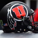
Uniforms for UCLA game
Welcome to Ute Hub › Forums › Utah Utes Sports › Football › Uniforms for UCLA game
- This topic has 17 replies, 13 voices, and was last updated 1 year, 9 months ago by
 bopahull.
-
AuthorPosts
-
-
 ProudUteParticipant
I really like the uniform combination. I would prefer the drum and feathers over the block Us. But, otherwise, I really like the look.
Go Utes!!!
-
 Tony (admin)Keymaster
— Utah Football (@Utah_Football) September 22, 2023
-
 Central Coast UteParticipant
Interlocking U isn’t my favorite either. It looks a lot like Houstons logo. Give me drum n feather every week.
-
 AlohaUteParticipant
These are my favorite (though I think I prefer the drum and feather helmet) and I think this should be Utah’s default look.
-
Central Coast UteParticipant
I agree. I love the color scheme and the overall uniform. I don’t mean to say I hate the interlocking U, I just prefer the drum n fearher.
-
 EagleMountainUteParticipant
Older I get the more I prefer just a straight up brand on something. It just makes things cleaner and recognizable.
-
Central Coast UteParticipant
Agreed. I’m 43 and have decided within the last few years that the drum n feather needs to stay. Especially since the actual Ute Nation likes it.
-
-
-
 CincyUteParticipant

-
 RedRocksParticipant
I like this combo, but I will never stop hating this font for the numbers.
-
 WhittyParticipant
I’m apparently in the minority, but I really love the font of the numbers. It’s unique from every other uniform in the country but very clean and matches the overall aesthetic of the uniform.
-
Matt
ParticipantI must also be in the minority. Love the font of the numbers, it is unique. Love the interlocking UU, especially on the white helmet. Also, always a fan of the red top/white pants look as well as the opposite on the road! I used to really love the drum & feather look but to me it feels dated and I am fine moving to the UU look. Best UU helmets though were the hand painted throwbacks from 2019, grey with the UU from 1966.
-
 YergensenParticipant
This ^^^
We aren’t recognizable to the college football fan.
I would rotate just between the home and road versions of this uniform. Because it appears we have been in decade plus long phaseout of drum and feather, I would move forward with interlocking U as our one distinct brand and get rid of the other brands and noise. Get rid of black as standard scheme color (don’t want to look like TTech) Don’t retire drum and feather entirely, but use it from time to time in throw back or special event.
-
Central Coast UteParticipant
Maybe it’s just me, but I would think if you want to be recognizable, you wouldn’t want to look like Houston or Ohio State.
-
-
-
-
 2008 National ChampParticipant
Agree on the font. Looks great in those individual pictures but with my eyes I can’t tell the difference between 0, 3, 6, 8, 9 in live action. It was even worse in previous years when they would use the black font.
-
-
 HPrete22Participant
If they made these uniforms black I would cry tears of joy.
-
AlohaUteParticipant
Yeah, that’s no for me bro. I would love to see less black in our color scheme. I love the classic red and white. That’s Utah.
-
-
HPrete22Participant
I love the red and white too, but a good black jersey at a night game is superior in my opinion
-
 bopahullParticipant
I am relieved our guys won’t have to go out there in just jocks and pads.
-
-
AuthorPosts
- You must be logged in to reply to this topic.